A quick introduction to OpenType
Hi! Sorry to keep you waiting!
Welcome to the world of OpenType!
My name is @ArcaneNibble.
But everyone calls me the…
ahem
Not sure what just happened there…
In all seriousness, this page uses a font which has been derived from that used in the later POKéMON Generation III games. I've converted it to OpenType and made use of several "advanced typography" features along the way. In this article I hope to show off OpenType, HTML, and CSS functionality which might not be widely known and how they can be applied even for Latin script.
If you just want the .ttf file, get it here. If you want the source code, it is here.
Are you even allowed to do this?!
I will preface this section by stating that "I am not a lawyer", but copyright and intellectual property protections for typefaces and fonts are much more inconsistent compared to other creative works.
In the United States, the shape of the letters themselves is not eligible for copyright. However, font software (a computer program which instructs a computer to produce letter shapes) is copyrightable, just like ordinary computer software. This means that commercial OpenType font files (which contain software) are protected by copyright. Bitmap images, in contrast, do not contain creative expressions of instructions (bitmap rendering is fixed and inflexible) and so are probably not protected in the same way.
In other jurisdictions such as Germany and the United Kingdom, typefaces are considered copyrightable. However, this form of copyright is weaker. It may last for a shorter amount of time, and, in the case of the United Kingdom, the legislation specifically allows for someone to "use the typeface in the ordinary course of typing, composing text, typesetting or printing".
However, more importantly, I think it is valuable to consider what the purpose of copyright is nominally "supposed to" be. Is it useful to preemptively restrict yourself from participating in building and remixing culture? Especially when a lot of modern culture is owned by large corporate entities?
tl;dr we're going to FAFO, but bitmap/pixel fonts are probably okay
What is a font?
I don't know about you the reader, but I personally found much of the terminology around typography very confusing coming from the digital era without having much cultural knowledge of how printing used to be done. Vague mentions of "Gutenberg" in history books isn't enough.
In a movable type printing press, the individual blocks with letters on them are called type or sorts.

Photo by Willi Heidelbach
The visual shape of a letter is called a glyph. A complete set of these individual type pieces (of a particular size and style) is a font. The design principles which go into designing a font (e.g. at different sizes or different weights) make up a typeface.
"Computer people" (some of whom were intentionally working on/with "publishing" and some of whom were not) then came around disrupting everything.
Bitmap fonts
For now, let's skip ahead and over all of the early history of digital typography and go straight to the era of video games and home computers. These systems tended to use bitmap fonts at a fixed low resolution due to hardware limitations.
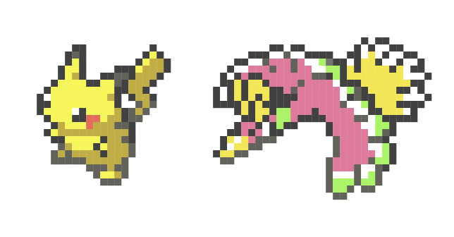
Commodore 64, IBM VGA, and Pokémon Generation II fonts
Many of these systems had hardwired logic for rendering "characters" or "tiles". In some cases, the shape of these characters was fixed into a ROM, and in other cases they were reconfigurable. However, these systems would in all cases render text as fundamentally composed of fixed-sized rectangles. It wasn't easy (or sometimes even possible) to render text at different sizes. Essentially, many of these systems only supported one single font.
The typefaces and fonts on some of these systems might've been designed by a "real designer" trying to optimize for readability, but it is just as possible that fonts on these systems were designed by a harried game programmer or electrical engineer.
Because a bitmap font contains information only at a given resolution, it doesn't scale nicely to other sizes. Scaling up either results in it becoming blurry or increasingly blocky and pixellated. Solving this problem requires the use of vector graphics.
OpenType
Separate from these systems which were just trying to "get something done", people were of course trying to digitize the traditional process of typography and typesetting. After many ideas were tried and much commercial competition occurred (between companies such as Apple, Adobe, and Microsoft), the situation culminated in a compromise file format called OpenType.
OpenType originally consisted of Microsoft extensions to Apple's TrueType format (the origin of the .ttf extension). TrueType itself was a competitor to Adobe's PostScript fonts. As a compromise format, OpenType can use either TrueType-style glyph outlines or PostScript-style glyph outlines. OpenType has since continued to evolve as users demanded more and more of digital typography and desktop publishing.
(If you are familiar with WOFF, it is merely a compressed variant of OpenType.)
In a typical font file, OpenType describes a typeface using Bézier curves, which are a particularly common form of vector graphics. These curves can be rendered, or rasterized, at different sizes and resolutions. Using other advanced features (variable fonts), the typeface can also change in weight (thickness) or other parameters, all of which would have previously required different fonts. This means that a single font file can now describe an entire typeface or even a family of related typefaces, and the entire process is well removed from dealing with cases full of physical type sorts.
Controlling all of this is all sorts of metadata, tables, and, in many cases, code. In the rest of this article, we will be exploring how this works.
Looking inside fonts
If you are comfortable with Python and the command line, the fonttools package can be used to look inside font files. The ttx utility converts between binary files and an XML representation of the information. Running ttx -f Emerald.ttf produces a file Emerald.ttx that can be opened in a text editor:
<?xml version="1.0" encoding="UTF-8"?>
<ttFont sfntVersion="\x00\x01\x00\x00" ttLibVersion="4.58">

  <GlyphOrder>
    <!-- The 'id' attribute is only for humans; it is ignored when parsed. -->
    <GlyphID id="0" name=".notdef"/>
    <GlyphID id="1" name="zwj"/>
    <GlyphID id="2" name="vs1"/>
    <GlyphID id="3" name="vs2"/>
    <GlyphID id="4" name="en"/>
    <GlyphID id="5" name="em"/>
    <GlyphID id="6" name="sp6"/>
    <GlyphID id="7" name="sp5"/>
    <GlyphID id="8" name="sp4"/>
    <GlyphID id="9" name="sp2"/>
    <GlyphID id="10" name="sp0"/>
    …
The process that I used to create this font from bitmap images also relies on fonttools, as the entire process is done programmatically rather than being edited in GUI font editor software.
Tracing pixel outlines
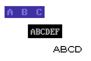
To bring this font into the world of OpenType, we need to convert it from a bitmap font. Because enough time has passed since the mass-market introduction of vector typefaces, the pixellated appearance of bitmap fonts is no longer a limitation but is now an intentional design choice to evoke a retro, nostalgic appearance. As such, we want to perform the conversion so that the typeface remains blocky and pixellated even as it scales to larger sizes:
ABCD
Because this font was designed for a device with a tiny screen, the result also scales quite well down to small sizes while remaining readable. Being an OpenType vector font also allows rendering engines to synthesize an italic form which never originally existed. This italic form can take advantage of modern high-DPI displays and isn't restricted to the same pixel grid as the original bitmap glyphs.
Overall, this is far more than a bitmap font could have ever been, back in the day!
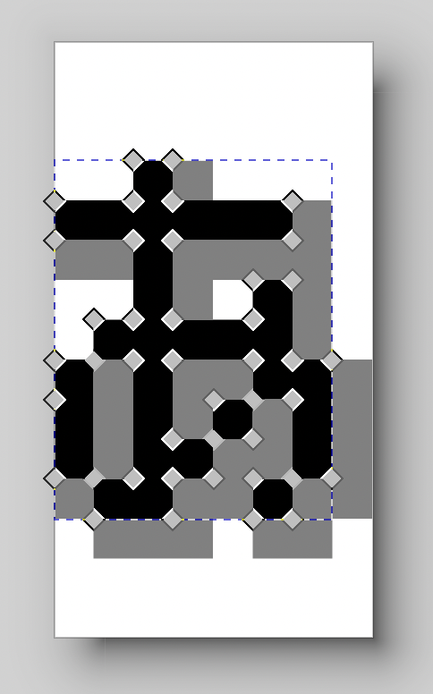
The naïve way to trace pixels into outlines might be to take the input bitmap font and, for each pixel which is filled, emit individual closed square path shapes.
Unfortunately, rasterizers tend to not like this. Doing this tends to result in tiny gaps between the pixels, even if I try to make the pixels slightly bigger to try to force them to overlap:
From a previous attempt at making an icon font from game sprites
To fix this, we need to fuse adjacent pixels together and generate a single path for each contiguous region. I'm not sure whether or not this is a well-known computer graphics algorithm (I couldn't find a reference), so I've invented my own.
The first step is to scan through a bitmap row-by-row and pixel-by-pixel. For each pixel, we mark which sides of the outline should end up in the final output. For an empty pixel, this is none of them. For a filled pixel, this starts out as all four sides. The code then checks whether the pixel above or to the left are also filled. If so, the shared side is unset on both this pixel and the other pixel.
![]()
After this step, we have various tiny path fragments which need to be joined end-to-end in order to form valid vector graphics paths. We had also previously been ignoring direction (clockwise or counterclockwise), but we need to pay attention now because OpenType only fills clockwise paths (and counterclockwise paths can be used to cut holes out of a filled region, such as in the letter "O"). In order to help with the next step, we prepare a few more data structures.
First of all, we take all of the path fragments and their directions and collect them into a big list.

Second, for each point between pixels, we store the path fragments which interact with that point.

We can then use the following algorithm to turn pixels into paths:
- Start with an arbitrary path fragment. Make its endpoint the current point.
- At the current point, determine what directions the algorithm can follow by using the "fragments associated with every point between pixels" array. If there are multiple choices, prefer a clockwise turn in order to properly maintain the clockwise path direction.
- If the direction changed, add a control point. If the direction did not change, replace the current point (making the current straight line longer).
- When all path fragments have been used, the algorithm is complete.

For debugging, this output can be converted to an SVG and opened in tools such as Inkscape. However, do note that SVG and OpenType have a different coordinate system (SVG uses a "computer graphics" convention with the y-axis pointing down, whereas OpenType uses a "mathematics" convention with the y-axis pointing up).
Colors
If you look carefully, you might notice that this typeface has a text shadow. This isn't created by CSS but in fact is baked into the font file itself. This is done using a technology which is used for color emoji, but it is in no way restricted to them.
Some of the earlier color font technologies (sbix, CBDT) worked by embedding color bitmaps inside an OpenType file. Unlike with early home computer bitmap fonts, these tables store large, high-resolution images which would be scaled down (which tends to work a lot better than scaling up). This technology was pretty clearly designed for emoji and didn't generalize well to other use cases.
Adobe came up with an idea for color vector fonts by storing SVG data inside OpenType. This is only supported by Firefox, but it can result in fun party tricks like an animated font.
The most widely supported technology which is actually usable in browsers is Microsoft's COLR and CPAL tables, and this is what I've used here. Fundamentally, the way this works is to break up each glyph into separate layers, one for each color. In this font, this means that one glyph contains the black "actual" pixels and a second glyph contains only the text shadow pixels.
The COLR table is used to indicate which layers to draw for each individual glyph and which palette entries to use for those layers. The CPAL table contains one or more palette choices which the type designer has determined ought to look good. The font I've created only contains a single palette, but, on the Web, @font-palette-values CSS rules can be used to manually override individual colors. For example, shadows can be green!? They can also be disabled by setting them to #00000000.
This usage of color layers is certainly a bit of a gimmick, but it allows for tricks such as the tiny red pixels which tell a user to press the dpadlr directions on the d-pad.
Character sets and coverage
I actually snuck in a little trick in that #00000000 example just now. Fonts which are used in video games might not contain every character that a modern system would expect. Likewise, they might contain graphic symbols which don't have obvious mappings to Unicode (despite efforts such as the "Symbols for Legacy Computing" block). Video games of the era in question would often also use a nonstandard character encoding. This needs to be dealt with in order to make a font file which is generally usable.
Some of these choices might be subjective and depend on how a type designer interprets the typeface and the Unicode standard. For example, I've chosen to map the ¤ symbol to the codepoint U+00A4 CURRENCY SIGN. This is semantically appropriate but differs from the normal rendering of the codepoint in most fonts. (On the other hand, 円 is mapped to its usual CJK unified ideograph codepoint at U+5186)
As for the problem of not containing enough characters, this font actually doesn't originally contain #. It also doesn't contain ordinary non-fancy quotes ('"), brackets ([]{}), or several other ASCII characters. Although it's possible to leave them out, font fallback can end up choosing something which looks very incongruous. In this case, I have custom-designed some glyphs for these characters (trying to maintain the look of the original typeface): "#$'*[\]^_{|}. I've also designed many custom glyphs by piecing together and modifying existing components (e.g. letters, accents) in order to improve coverage for European languages. This means that you can now write ő if you're from Hungary, ŵ if you're from Wales, ð if you're from Iceland, etc.
Ligatures
Creative interpretation of the Unicode specification can handle many symbols, but what can you do if you really wanted to become a PkMn TRAINER? Or if your pet really loves the taste of PoKeBLOCK.s? Or if you're merely celebrating reaching Lv100?
I've chosen to encode these by using zero-width joiner sequences, which are probably best known in English for being used to combine sequences of emoji such as 👨👩👦 out of U+1F468 MAN + ZWJ + U+1F469 WOMAN + ZWJ + U+1F466 BOY. In this case, this means that Pk becomes Pk when a ZWJ character is inserted in the middle.
Yes, this means that you can also create your own emoji ZWJ sequences, as long as you can get users to use your font file. Want custom flags? Facial features? Skin tones? You don't have to wait for Apple nor the Unicode Consortium.
Configuring all of this requires using the very complicated GSUB glyph substitution capability. Fundamentally, this capability allows for replacing certain sequences of glyphs with certain other sequences of glyphs, but only within an appropriate context (which can include surrounding glyphs, an appropriate language, a user setting, or other parameters). For example, in traditional Latin script typography, sequences such as "fi" might optionally get replaced with a form where the "f" overlaps the dot of the "i". Arabic and Indic scripts might require various substitutions, but only given certain surrounding letters.
In this font, I placed all of the ZWJ sequences inside the rlig (required ligatures) OpenType feature which should always be enabled for Latin script.
For something which really abuses ZWJ sequences, gamepad icons can be referred to by inserting multiple ZWJs in a magic code such as btnst in order to tell the user to press the btnst button.
Variation Selectors
Finally, how do we handle the situation where the game's Latin and Japanese fonts render certain characters slightly differently? One possibility is to create two separate font files. However, there is yet another way—Variation Selectors.
These characters have a number of uses including specifying minor variations in CJKV characters which do not have separate codepoints (i.e. they are semantically "the same" character, but different forms may be preferred in different countries). However, once again OpenType allows us to define our own nonstandard ones, and they will be stored in a special part of the cmap table.
This allows us to specify variations like this: ♂︀♂︁♀︀♀︁. The second character in each pair comes from the Japanese font, and they are accessed by adding U+FE01 VARIATION SELECTOR-2 after the character (U+FE00 VARIATION SELECTOR-1 selects Latin glyphs, which does nothing in this context as they are the default).
Language-dependent substitutions
In GSUB tables, it is possible to define language-specific character substitutions like the following: I wish this text was in にほんご!
This is tagged using a lang="ja" attribute in HTML and uses the locl feature and JAN (Japanese) Language System (LangSys) in OpenType. I've mapped the standard 26 Latin letters, the digits 0-9, and the ?! punctuation to their fullwidth glyph variants, which is what would happen in a Japanese edition of the game. I've also mapped many of the special glyphs and ligatures to their Japanese variants, but I haven't mapped e.g. the period . to the ideographic full stop 。 as these characters are semantically different.
If this is undesired, font-feature-settings: 'locl' 0 in CSS can be used to disable it: I wish this text was in にほんご!
This can be combined with variation selectors, as long as the font is correctly programmed:
Default glyphs, followed by forced-Latin, followed by forced-JP, language tag ja: ♂♀LvPPID🡅 ♂︀♀︀Lv︀PP︀ID︀🡅︀ ♂︁♀︁Lv︁PP︁ID︁🡅︁
Default glyphs, followed by forced-Latin, followed by forced-JP, language tag en: ♂♀LvPPID🡅 ♂︀♀︀Lv︀PP︀ID︀🡅︀ ♂︁♀︁Lv︁PP︁ID︁🡅︁
Some complexity and compatibility issues can occur here because different systems may process these OpenType features in different orders. For the most part, for "standard" scripts, features are processed in the order in which "lookups" are defined in the GSUB table. However, complex scripts will always process certain features before certain others. Consult the Microsoft script development specs for more details.
Have fun!
WALLACE: Come on, let's record your
name as a HACKER who triumphed over
digital typography, and the lines of
horrible Python which battled with you.